All the research was about looking at those without money, which is probably the best wys to describe personal upbringing, making the best of what is there and going without what cannot be afforded.
This was going to be reflected in the images taken for this assignment. However through consideration it was decided not to follow this path and to just get one strong image of the interaction of both Brian and Alison. Although not having much did in some minor way affect upbringing, they both scarificed a lot and did all they can to raise their four children. And they did a good job.
Personal desires when it comes to photography is documenting people in need and gaining peoples attention in order to try to mobilise help for them. This could be applied, but it was decided that it would be unfair and unreasonable to do so.
All the planning and research was done within three days and the test shots were done soon after. The final image was taken after careful thought of how to show what little interaction there is between both parents.
The motivation to turn the assignment out quickly and effectively showed that it is possible to work quickly and produce quality research, continual development and a desirable final image.
There is time and opportunity to further develop the ideas, so if the chance arises and the ideas are developed, this will be added to.
Wednesday, October 14, 2009
Final images

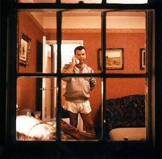
(i) The TV does indeed control the household, everything stops when there is something on worth watching. There is no interaction unless necessary, unless something is needed or something needs to be said. In many ways it does reflect most households, where people are too used to watching the box that making their own entertainment through interacting with ones own family. The framing of the composition using the edited window frame works very well and the busyness of the image, through the reflections evident, adds to its appeal.

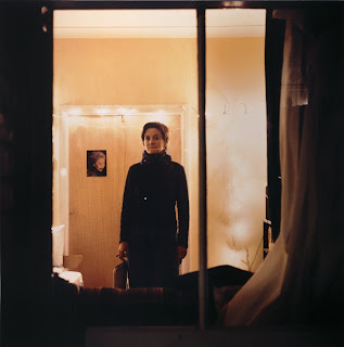
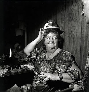
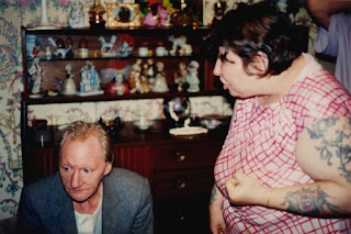
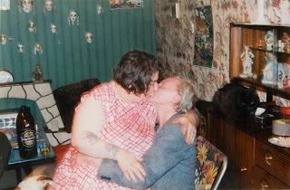
(ii) This is a rare insight into the lighter side of family life. A rare smile shared between parents. Normally life tends to be a bit of a resented struggle, with few reasons to be joyful. The viewpoint from which the image was taken suggests stepping back; looking more from the outside in. The two figures are framed by the door and the doorway becomes the focus because of the lines of the shadows and skirting boards. Not only does it show something about their relationship it shows enough of the house to gain an insight into living conditions.
Editing the images
The editing of the images was very straiht forward, very little could be done when it came to adjustments because of the low light levels used when shooting. When the slightest alteration was attempted on levels or contrast for example, there was a huge difference in how the image changed.
Both of the two final images were cropped and any imperfections were cloned out. For the kitchen composition it was burnt in a lot on the left side to shift the attention from the shelf and mirror onto the figures, it was then given a texture filter as if painted on canvas, to diguse the graininess of the image. The composition of watching TV was edited so that there was a fourth side to the window frame, rather than just the original three. A few reflections were cloned out but most were left in.
Both of the two final images were cropped and any imperfections were cloned out. For the kitchen composition it was burnt in a lot on the left side to shift the attention from the shelf and mirror onto the figures, it was then given a texture filter as if painted on canvas, to diguse the graininess of the image. The composition of watching TV was edited so that there was a fourth side to the window frame, rather than just the original three. A few reflections were cloned out but most were left in.
Results of shoots
The two shoots took abot half an hour each, because of all the planning and experimentation, it was just about staging or waiting for the right situation.
The tv shoot was simple, the idea behind it was to portray how ‘lost’ people do get when they are engorse in their viewing, all conversation and interaction seems to stop, as if there is no one else in the room.
The shoot in the kitchen was designed to look at my parents relationship, it is very rare that they do spend time with each other, there is always something to be done. Most of the interaction comes in passing, grabbing moments when the body is occupied but when the mind is free.
There were four images that stood out, they are all unedited:

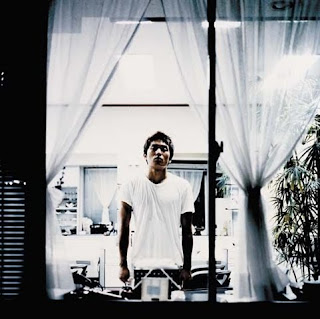
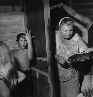
(i) It is a srong image that suggests that he is being looked over, like he has to be kept an eye on to make sure he does the washing up right. She appears to be talking to his back while he is getting on with the washing up. Eventhough the compoositon appears warm and wlcoming through the colours on display, the body language of the figures appears cold and distant.

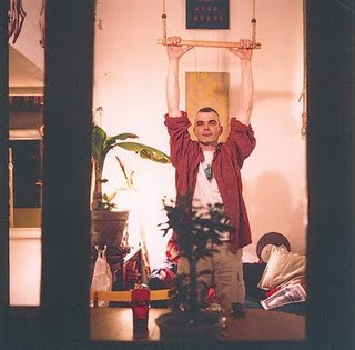
(ii) In this one Brian is looking round and smiling, suggexting that something amusing has bee revealed or a joke has been shared. The body language is no longer as cold as there is the interaction that was missing from the first composition, combine this with the warming colours, it seems a welcome, inviting set of cirumstances.

(iii) Watching the TV. Both stes of eyes are fixed on the box. There is no interaction whatsoever between the pair of them. They are both engrosed in whatever it is they are watching. With them sitting on separate piece of furniture is aso implies distance between them, not only in the physical, where they are sitting, sense. The relections in the window, of the car, lamposts and other houses do distract but it they are liked.

The tv shoot was simple, the idea behind it was to portray how ‘lost’ people do get when they are engorse in their viewing, all conversation and interaction seems to stop, as if there is no one else in the room.
The shoot in the kitchen was designed to look at my parents relationship, it is very rare that they do spend time with each other, there is always something to be done. Most of the interaction comes in passing, grabbing moments when the body is occupied but when the mind is free.
There were four images that stood out, they are all unedited:

(i) It is a srong image that suggests that he is being looked over, like he has to be kept an eye on to make sure he does the washing up right. She appears to be talking to his back while he is getting on with the washing up. Eventhough the compoositon appears warm and wlcoming through the colours on display, the body language of the figures appears cold and distant.

(ii) In this one Brian is looking round and smiling, suggexting that something amusing has bee revealed or a joke has been shared. The body language is no longer as cold as there is the interaction that was missing from the first composition, combine this with the warming colours, it seems a welcome, inviting set of cirumstances.

(iii) Watching the TV. Both stes of eyes are fixed on the box. There is no interaction whatsoever between the pair of them. They are both engrosed in whatever it is they are watching. With them sitting on separate piece of furniture is aso implies distance between them, not only in the physical, where they are sitting, sense. The relections in the window, of the car, lamposts and other houses do distract but it they are liked.

(iv) The same set up as before but this time the timer on the camera was used, and a few self-portraits with family were taken. Standing directly infront of the TV rather than at the peripheries meant being fully rather than partially lit. It looks odd, as if imposed over the last image reviewed. It is intreguing, but it was more a bit of fun. This idea cold be explored further, looking towards being ‘alone around family’.
The shoots
(i) Watching TV: The camera was set up outside on the front lawn on a ripod, at approximately 9pm. The composition was framed using the middle window frame. The figures were asked to sit and watch tv in their ‘usual’ chairs. The images were taken without any guidance of where to look or what to do, they were as natural as possible.
(ii) Looking into the kitchen: Inspired by the test shots the idea was to completely stage this shoot. Father Brian was asked to stand by the sink as if finishing the washing up, with mother Alison standing leaning, with the back against the door frame, as if chatting to Brian. The idea was to create a sillhotte, and to place Brian as the focus of the images.
(ii) Looking into the kitchen: Inspired by the test shots the idea was to completely stage this shoot. Father Brian was asked to stand by the sink as if finishing the washing up, with mother Alison standing leaning, with the back against the door frame, as if chatting to Brian. The idea was to create a sillhotte, and to place Brian as the focus of the images.
Tuesday, October 13, 2009
Test shots
There have been over 130 test shot taken covering everything involved in the ‘refined ideas’ section. The images do portray a section of family life; however they are just too ordinary and hold little interest. There are a few images that do stand out.
In no particular order:
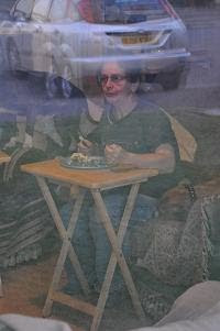
(i) Mother Alison watching tv surrounded by dogs, a typical evening meal. The food is cooked, tables are put up, tv is turned on then the food is eaten. Not the most exciting image, but the reflections on the windows are interesting, it portrays the family car.

(ii) Nephew Callum watching the tv being closely watch by Tia. As soon as any food is dropped or isn’t being guarded, then it goes. Although she is well trained she does sometime forget herself, she is continuously reminded.

(iii) The examination of three generations of the family; mother, daughter and granddaughter. It is the first time they have got together for a while, so are keen to share stories and exchange items that have been brought.

(iv) Created using the timer on the camera. A self-portrait with family. Done for fun but creates interest. The only figure that it aware that their behaviour is being monitored and recorded. May well be further explored.

(v) The favourite of all taken. Father Brian doing the washing up in the kitchen after Mother has cooked. Lonely feel to the composition, almost as if segregated form rest of family who are watching the tv.
The ideas that will be followed and re-shot are those focusing on watching tv (shot from both inside and through a window, possibly as a self-portrait) and household activities (cooking and washing up).
The ideas that will be followed and re-shot are those focusing on watching tv (shot from both inside and through a window, possibly as a self-portrait) and household activities (cooking and washing up).
Refined Ideas
The ideas being considered are as follows:
Family gathering: documenting an up coming birthday party.
Everyday activities; shoot family member doing cooking, washing up, watching tv.
Shooting through a window or door way
There will be a lot of experimentation as it is not sure just what will work. Images will be taken with subject both aware and unaware, also some will be staged and others won’t.
Consideration
It is very hard when considering how to portray ones own family. No one wants any hurt feelings. But then there are always things that people wish to question or change. It is easy to imagine a good set of images with a clear narrative behind it, but would it be fair to shoot or present it, without full consideration of the consequences. There are a number of ideas held that wont be discussed about emotions and resentments held.
Reaction to the research
The images show the huge differences between families with and families without money. The main focus is on those without and what their everyday life entails; whether this is fighting to survive, fighting with each other, or fighting to enjoy everything that provides pleasure.
The details in the images, although often very subtle, narrate each image. It is possible to gain more information from them than is there, mainly through or own knowledge of similar situations or from stories we have heard. Often our own views and stereotypes add depth that may not be there, but we think is universal in similar situations.
The surprise that arose was just how much emotion can be seen and is felt when viewing certain images. This ranges from empathy for the subjects, pity for there situation, anger that it is or has happened and a desire to help.
This has encouraged a rethink of what and how to present life through the images to be taken. What should be portrayed, should they be staged, should they reflect a positive or negative aspect of life, there are so many points to be considered.
Monday, October 12, 2009
Further research: Shizuka Yokomizo - Stranger
This is nothing to do with family, quite the opposite, but there are those who feel like a stranger in their own family. Those who don't fit and who feel they don't belong.
In the Stranger series, each photograph shows someone looking out through a window. The artist has never met any of these people. She selected their addresses and then wrote an anonymous letter asking if the recipient would stand at a particular window, alone, with the room lights on, at a specific time of night so that she could photograph them from the street. It focus’s on the gap between ‘self and other’. (From sitegallery.org)
(i) This gentleman clearly has money, yet he presents himself for the photographer only partly dressed, on the phone and with his hand behind his back. He is very, almost too relaxed, in his own home, knowing what is happening.
(ii) She is in very simple surroundings, quite plain and sparse. She is well dressed, neat and well kept. She stands very straight and stares out of the window away from the photographer. Quietly confident.
(iii) He seems very relaxed; his house is designed for him, his comfort and relaxation. It looks an inviting place. He comes across as a friendly person who knows more than most. He seems very content with who he is.
It is a very odd series, but does indeed question the self and its relationship to others. Society as a whole is extremely segregated; people can live next to others for years and no little or nothing about them. It gets you questioning what our priorities are and if they need to be changed.
In the Stranger series, each photograph shows someone looking out through a window. The artist has never met any of these people. She selected their addresses and then wrote an anonymous letter asking if the recipient would stand at a particular window, alone, with the room lights on, at a specific time of night so that she could photograph them from the street. It focus’s on the gap between ‘self and other’. (From sitegallery.org)
This series has always been an intrigue; the images have always held attention, more for their seeming pointlessness rather than anything else. But when recently viewed closely as a group it is apparent that their draw lies in the individuality of the compositions when seen together.

(i) This gentleman clearly has money, yet he presents himself for the photographer only partly dressed, on the phone and with his hand behind his back. He is very, almost too relaxed, in his own home, knowing what is happening.
(ii) She is in very simple surroundings, quite plain and sparse. She is well dressed, neat and well kept. She stands very straight and stares out of the window away from the photographer. Quietly confident.

(iii) He seems very relaxed; his house is designed for him, his comfort and relaxation. It looks an inviting place. He comes across as a friendly person who knows more than most. He seems very content with who he is.

(iv) This is a very rigid, forced posture, very unnatural. It is a very busy room in which he is photographed, yet it is very clean. The only things that aren’t black or white are the plan and his colouring. He almost seems unable to be natural.
It is a very odd series, but does indeed question the self and its relationship to others. Society as a whole is extremely segregated; people can live next to others for years and no little or nothing about them. It gets you questioning what our priorities are and if they need to be changed.
Research: Mary Ellen Mark – American Odyssey
Born in 1940, in Philadelphia, Pennsylvania. It is a collection of black and white photographs taken between 1963 and 1999, touching on issues of poverty, discrimination, and life in America. Her subjects are mostly people of the economic and social underclass’s as they pursue their hopes and dreams, while dealing with their day-to-day problems. (From barnesandnoble.com)

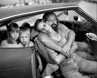
(i) The family are gathered on the bed in one room, it is clearly a family in need. The state of the surrounding cries out ‘help me’. The clutter on top of the cabinet combined with the broken down nature of the cabinet itself, shows just how little they have, this may be their entire living space, their lives played out within this room. The focus of the image is the young girl looking up, the despair on her face it very clear to see, the sense of wanting to help them that this image instils in immense.
(ii) This is their home for the time being. The mother looks near death, is it a life worth living? The children are scared and lost, what future do they have to look forward to? The father is cradling there mother, he gives a look of ambivalence, almost as if angry with life and with himself for not being able to do more for his family. This is personally one of the poignant images ever seen, it develops such emotional.
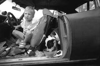
(iii) The boy looks as if he is crawling out of his hiding place in a junk yard; however it is his pet that sits just behind him. This car has been his home, look at the state of it, bits of debris everywhere, it’s a horrible thought. The dog may eat as well has he does. He could be a child from a third world country, out on the streets by himself relying on what bit of food he can scavenge to survive, yet this is America no more than 20 years ago.
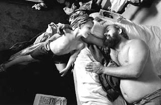
(iv) Back in accommodation, the boy and the father share a touching moment. Their eyes meet and they both smile, the bonds that exists given the circumstances is as strong as between any father and son. It is probably the strength they hold that kept them going and it will serve them well if things do not improve. They now have a carpet, a comfy bed and possession; nothing overly special, but they must mean the world to this family.
(v) The boy is stood against the wall, he looks upset. He must have just been disciplined and sent to stand up against the wall to think. The children are still being kept in line, they are not being left to run wild. Again it is clearly only one-room accommodation, now with tv, it must feel like a palace.
This is a very strong set of images about this one family. Photographed a number of times over about 10 years, it shows the emotional plight of one family and their struggle to survive. It really does show that even in the richest of countries, there are still those who barely have enough to live!

(i) The family are gathered on the bed in one room, it is clearly a family in need. The state of the surrounding cries out ‘help me’. The clutter on top of the cabinet combined with the broken down nature of the cabinet itself, shows just how little they have, this may be their entire living space, their lives played out within this room. The focus of the image is the young girl looking up, the despair on her face it very clear to see, the sense of wanting to help them that this image instils in immense.

(ii) This is their home for the time being. The mother looks near death, is it a life worth living? The children are scared and lost, what future do they have to look forward to? The father is cradling there mother, he gives a look of ambivalence, almost as if angry with life and with himself for not being able to do more for his family. This is personally one of the poignant images ever seen, it develops such emotional.

(iii) The boy looks as if he is crawling out of his hiding place in a junk yard; however it is his pet that sits just behind him. This car has been his home, look at the state of it, bits of debris everywhere, it’s a horrible thought. The dog may eat as well has he does. He could be a child from a third world country, out on the streets by himself relying on what bit of food he can scavenge to survive, yet this is America no more than 20 years ago.

(iv) Back in accommodation, the boy and the father share a touching moment. Their eyes meet and they both smile, the bonds that exists given the circumstances is as strong as between any father and son. It is probably the strength they hold that kept them going and it will serve them well if things do not improve. They now have a carpet, a comfy bed and possession; nothing overly special, but they must mean the world to this family.

(v) The boy is stood against the wall, he looks upset. He must have just been disciplined and sent to stand up against the wall to think. The children are still being kept in line, they are not being left to run wild. Again it is clearly only one-room accommodation, now with tv, it must feel like a palace.
This is a very strong set of images about this one family. Photographed a number of times over about 10 years, it shows the emotional plight of one family and their struggle to survive. It really does show that even in the richest of countries, there are still those who barely have enough to live!
Research: Larry Fink – Social graces
Born in Brooklyn in 1941 and studied in NY in the 1960s. Produced in the 1970's, the series provides intimate glimpses of real people and their all-too-fallibly-human lives. But there was a greater purpose in mind; he wanted to explore social class. The series compares two radically different worlds: that of wealthy Manhattans and that of rural, working-class Pennsylvanians. (From nytimes.com)
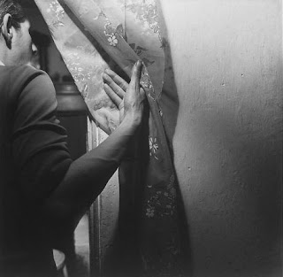
(i) Peering around a curtain at a birthday party. This is the sort of composition where you want to know what the figure is seeing. Anything could be going on and that is the beauty of it; the air of mystery. The hand is the centre of focus, holding the drape out of the way as he moves through. It really does say very little about the family and surroundings in which they live, but it does grab attention and stimulate imagination.
(ii) This is a very busy composition, with arms and bodies everywhere. This woman is trying to bring out a birthday cake without it being knocked from her and hand ruined. It is clear from the clothes and the quality of the building seen that this is a poor family, trying to the best out of what they have, determined to put on a good party and make sure everyone has fun. It is a snapshot, one moment of many that we all associate with birthdays, the serious preparation behind the frivolities.
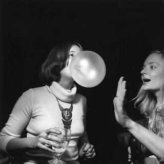
(iv) This image is of two young women clearly of higher class. This is clear from the clothes; they are better quality, perfectly clean and the women themselves are perfectly presented, both with alcohol in hand. They share a pleasure that so many have enjoyed, trying to blow the biggest bubblegum bubble. It never ceases to amaze some.
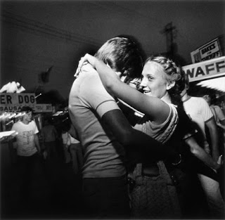
(v) The delight on this young woman’s face is evident; she is out at a gathering with someone whose company she very much enjoys. The body language shows a clear attraction; the closeness and the placing of their arms. Everyone in the background is getting on with enjoying themselves without a care.
The images collated show a huge distinction between those with and those without. The types of events or gatherings that provide enjoyment do differ, manly to do with upbringing and money available. People without money make the most of parties as they are rare occasions for enjoyment. People with money often have contrasting views on what makes them happy, usually involving spending a lot of money, and being away from their home, somewhere different, somewhere exciting.

(i) Peering around a curtain at a birthday party. This is the sort of composition where you want to know what the figure is seeing. Anything could be going on and that is the beauty of it; the air of mystery. The hand is the centre of focus, holding the drape out of the way as he moves through. It really does say very little about the family and surroundings in which they live, but it does grab attention and stimulate imagination.

(ii) This is a very busy composition, with arms and bodies everywhere. This woman is trying to bring out a birthday cake without it being knocked from her and hand ruined. It is clear from the clothes and the quality of the building seen that this is a poor family, trying to the best out of what they have, determined to put on a good party and make sure everyone has fun. It is a snapshot, one moment of many that we all associate with birthdays, the serious preparation behind the frivolities.

(iv) This image is of two young women clearly of higher class. This is clear from the clothes; they are better quality, perfectly clean and the women themselves are perfectly presented, both with alcohol in hand. They share a pleasure that so many have enjoyed, trying to blow the biggest bubblegum bubble. It never ceases to amaze some.

(iv) This image is of two young women clearly of higher class. This is clear from the clothes; they are better quality, perfectly clean and the women themselves are perfectly presented, both with alcohol in hand. They share a pleasure that so many have enjoyed, trying to blow the biggest bubblegum bubble. It never ceases to amaze some.

(v) The delight on this young woman’s face is evident; she is out at a gathering with someone whose company she very much enjoys. The body language shows a clear attraction; the closeness and the placing of their arms. Everyone in the background is getting on with enjoying themselves without a care.
The images collated show a huge distinction between those with and those without. The types of events or gatherings that provide enjoyment do differ, manly to do with upbringing and money available. People without money make the most of parties as they are rare occasions for enjoyment. People with money often have contrasting views on what makes them happy, usually involving spending a lot of money, and being away from their home, somewhere different, somewhere exciting.
Research: Richard Billingham – We are family
Richard Billingham was born in Birmingham in 1970. He began taking photographs while studying fine arts at Sunderland University. The subjects are his father ray, his obese and tattooed mother Liz, and his unruly younger brother Jason. He documents their squalid surroundings and violent relations to each other with unflinching honesty. (From designboom.com)

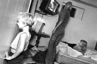
(i) Look at the separation between the couple; they could not be further from each other even if they tried. They both look as if they are in their own worlds and wish to stay segregated from the other. Liz is focused on the tv and Ray appears to be in a world of his own.
(ii) This is a very threatening posture displayed by Liz, it is clear that this is a very destructive relationship. Ray is looking away, ignoring the threat that is present. Does he care or is he just hoping that the display of anger will soon pass.
(iii) The dogs looks like he is in trouble. Ears down, head lowered and eyes slightly raised. With the knowledge that Ray is an alcoholic, could only be a minor thing that the animal has done wrong. Either way it is an intense situation, it is clear to imagine what is going to happen next.

(iv) The making of a cup of tea. It is clear that there is something besides hate and resentment in their relationship. This is the first of the images seen to far where the eyes do not solely focus on the figures. The attention is on the state of the house itself, it’s rundown, patchy, tatty nature.
(v) Probably a rare moment of affection being displayed here. The battle pauses for a brief moment of piece. From the other compositions is must be a horrible household to live in, but there is something. It does however beg the question of what is holding the household together. It is clear that it is not love, is it the fear of not being together.
From looking at the images as a set it is obviously an unhealthy working class environment; where children (and the adults themselves) are going to suffer. The images not only portray the problems within the relationship, but also the state of the surroundings in which they live.

(i) Look at the separation between the couple; they could not be further from each other even if they tried. They both look as if they are in their own worlds and wish to stay segregated from the other. Liz is focused on the tv and Ray appears to be in a world of his own.

(ii) This is a very threatening posture displayed by Liz, it is clear that this is a very destructive relationship. Ray is looking away, ignoring the threat that is present. Does he care or is he just hoping that the display of anger will soon pass.

(iii) The dogs looks like he is in trouble. Ears down, head lowered and eyes slightly raised. With the knowledge that Ray is an alcoholic, could only be a minor thing that the animal has done wrong. Either way it is an intense situation, it is clear to imagine what is going to happen next.

(iv) The making of a cup of tea. It is clear that there is something besides hate and resentment in their relationship. This is the first of the images seen to far where the eyes do not solely focus on the figures. The attention is on the state of the house itself, it’s rundown, patchy, tatty nature.

(v) Probably a rare moment of affection being displayed here. The battle pauses for a brief moment of piece. From the other compositions is must be a horrible household to live in, but there is something. It does however beg the question of what is holding the household together. It is clear that it is not love, is it the fear of not being together.
From looking at the images as a set it is obviously an unhealthy working class environment; where children (and the adults themselves) are going to suffer. The images not only portray the problems within the relationship, but also the state of the surroundings in which they live.
Initial Ideas
Family gatherings: Birthday parties, weddings, family meals, family barbeque.
Holidays and days out: Family holidays, day trips, picnics.
Everyday excursions: Trip to the shops, weekly shop, school run, children’s play area.
Everyday occurrences: Washing up, watching tv, cleaning, washing up, eating.
All the proposed ideas are simple enough, but how is it best to produce them? Should they be staged, or should they be taken unawares? Could they be done either through a window or from another room? Taken during the day or at night?
Research into existing bodies of work may well provide ideas and answers on what has already been done, how it was achieved, why it came about and what the work says about the subjects.
Definitions
The three words that really stand out from the list are as follows. The three are highly related, so it seems important to consider all three.
Voyeurism: The practice of being a voyeur: One who views or inspects.
Revealing: To lay open to view; display; exhibit.
Privacy: The state of being free from intrusion or disturbance in one's private life or affairs.
From these three definitions it is clear that all three can be conjoined using one image. To view, present and reveal unknown information of ones family would cover everything. The question rises as to how to do it and what to display about that family group.
Initial reaction
When this brief was revealed the initial thoughts that sprang to mind where that of the iconic images of Richard Billingham and his emotional portrayal of his own family. The series entitled; ‘we are family’ are explosively powerful.
The brief asks for an exploration of immediate family, this is an interesting topic as it could include or even lead to a lot if introspection of what in many cases of people I know is taken for granted; their family. The good and the bad, what is known and also what is hidden.
The brief asks for an exploration of immediate family, this is an interesting topic as it could include or even lead to a lot if introspection of what in many cases of people I know is taken for granted; their family. The good and the bad, what is known and also what is hidden.
Assignment Brief: Family
This assignment requires you to investigate the world of your family members. You must respond to one of these words;
Intrude, Age, Revealing, Voyeurism, Child, Privacy, Social, Class, Culture.
You will choose one of these words to help inspire you and direct you image making. You will be required to produce one A3 sized photograph from a digital image on screen and printed for your portfolio.
Intrude, Age, Revealing, Voyeurism, Child, Privacy, Social, Class, Culture.
You will choose one of these words to help inspire you and direct you image making. You will be required to produce one A3 sized photograph from a digital image on screen and printed for your portfolio.
Monday, October 5, 2009
Evaluation
The shock of the amount or research to be done was that balanced by the annoyance of then how little had to be done after the initial amount had been researched. The annoyance past when it was realised that it been worth it.
The research undertaken meant that there were plenty of ideas of where to start, and once the chosen word had been contemplated, there was no stopping. Ideas flowed freely and the initial shoot resulted in their being plenty of good compositions.
The main problem was with Photoshop, the time wasted while waiting to edit the images was frustrating. But once the programme was available the experimentation could begin. The visual communication seen in the research allowed the final compositions to be played with. Using burning in to change the focus of the images and experimenting with black and white to enhance the tones and textures allowed the final images to shine.
During this assignment it was clear that personal time management skills were more than up to the task as well as the skills gained for effective researching. When problems did arise, time to reflect and question soon overcame the blockage.
The time given to complete the assignment, given its cut-down final state was more than enough. It was not a challenge, but it was enlightening, both when it came to planning and producing still life work and when it comes to how useful a bit of personal pressure can be in driving forward (especially when there is a huge amount of initial research required).
The final images and comments
Final image 1

It is a strong image; the burning around the edges does accentuate the diary on the table top and also removes a lot of the ‘floating’ distraction that was apparent before editing. The main draw of the composition is the difference in texture of the wooden floor, the table top, the diary and the pencil. The main focus however is the heart on the book; it contains the only lines in the image that are not straight. Another contrast is the roughness of the pencil and diary cover when compared to the smooth floor and table. It does look a lot better in black an white than in colour, the tones and textures and exaggerated and that is what proves to be its strength.
Final image 2

Personally this is the better of the two, but there both are very good. The angle at which the photograph was taken was carefully chosen and works to help show the shadows cast by the items: The textures of the diary have become more visible to the viewer than on the other composition. With some of the items themselves it shadow it serve to change the focus. Again it is the heart on the diary as it contains the only lines in the image that are not straight and because the depth of field is quite shallow; it is centred on the heart. The two pencils serve to frame the diary again bringing the views attention back on to it when it strays.
Editing the two final images
The levels and the hue and contrast were altered then they were cropped slightly to centre the main focus of each composition. Both had imperfections that had to removed; this was done using the clone tool. After that all that had to be done was to turn them both to black and white using channel mixer and a bit off burning in was performed to exaggerate area or distract attention from them.
Thursday, October 1, 2009
Reflection
The uploading of all the work onto the blog site has been very straight forward; if everything had been in place initially the task of adding so much would not have been quite so laborious.
There have been a few problems with the site: When it comes to placing text with images, the text does not always line up as desired with the corresponding compositions. And as of yet there is still limited personal knowledge of what can be done using the site, so the layout is basic.
There are a few disappointing aspects to using a blog instead of iWeb. No galleries can be created, this means that all images have to be loaded individually. But before then can be loaded they have to be carefully selected so as not to flood the blog with pictures and they also need to be resized so that they do not take an eternity to load.
Work on this assignment has progressed quickly with no problems. The ideas were easy to develop, the researched proved simple yet time consuming, the shoot was easy to arrange and the images produced were all good examples of still life.
The problem now is waiting; as soon as Photoshop is up and running, the images can be edited and experimented with and a final image(s) can be decided upon. Plus if any do need to be reshot, this can quickly be arranged.
Where next?
Upon closer inspection of the images, it is clear that the final image will come from either;
Photo frames on table tops of different levels, taken from obscure angles (as in image 03).
Or
The diary on the table top; either close-ups of it with a shallow depth of field (image 02) or a simple arrangement on the ‘floating’ table top (image 04).
Results: Diary


This is definitely the preferred idea, with already one possible final image jumping out. Image 01 is suggestive of a writing desk with the book and writing implements to hand. It has height, form, tone and texture. However it is image 02 that stands out the most: it has a shallow depth of field with the focus of the design and tones of the diary; the shadows created by the items grab the viewer’s attention and gives it an atmosphere of melancholy. The final two images (03 and 04) are very similar. The main pull of these compositions is the fact that the table top appears to be hovering above the floor, the fact that the grains of the different woods, emphasise this illusion. It is the simplicity of image 04 that appeals; it is very clean, with good textures, again it is very strong.
Results: Photo frames


The clean lines of the frames, works well with the table edges as does the contrast between the different types of wood on show (as in image 01). The ideas behind them all are very simple, which is why they work well. This contrast is exaggerated in image 02 because of the angle it is shot at; this also gives the feel of depth. A better impression of levels is evident in image 03; this is very strong, as it contains form, depth, height and contrast.
Results: Trinkets


The images themselves are good, but not personally overly appealing. The photographs do show the colours, shapes, tones and textures, but they lack the grab of some of the images to come. The use of angles and depth of field works very well, and the added suggestion of a story behind the compositions also adds to their appeal. There is nothing really wrong with them, but they lack emotion.
Experiments
The experiments are based around three ideas:
Fairy ornaments on a window ledge.
Photographs in photo frames arranged on a table top.
A diary and writing implement also on a table top.
The shoot was done a living room, with huge windows for a lot of natural light. The room was cleared as best it could be to minimise other objects in the compositions.
The idea for using table tops came from the concept of getting contrasts between the photo frames / diary (both wood / wood effect) and the table tops, but also a third contrast with the laminate flooring.
Besides using different angles to shoot from; different levels have also been introduced: a higher and lower table; plus the height down to the floor itself.
Intentions on how to proceed
The best thing to do may well be to collect every item available that can be related to ‘memory’ or to a ‘personal’ memory held and see what can be grouped together or what stands on it own to best portray the word; at least from a personal viewpoint.
The next step would then be to find a place to set up the items for the still life composition. This could range from a window-ledge, a table a door step to the garden itself.
Points that will be considered
- The objects: Their form, shape, texture and colour, when grouping them.
- Location: The amount of natural light available or the amount of light that is desired for the composition.
- When taking the photographs: The position (above, from an angle, etc.) and distance of the camera. The desired depth of field.
- When editing: Black and white vs colour. Tones and textures vs colours and shapes.
Research: Todd Schoenbaum
Very little biographical information available.


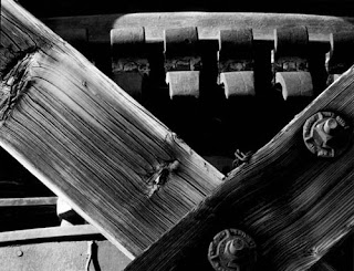

Each of these mages has been taken as the arrangements were found using only the natural light available. The knowledge of this combined with the simplicity of the images leaves the viewer in awe. The compositions are beautiful, almost as if perfect. The images are all recognizable objects that can be sought out by anyone who knows where to go.
The choice of black and white photography again draws the viewer into focusing on the shapes and lines of the items; the tonal range causes the eye to examine each detail of the compositions. The images show the value of experience when it comes to taking a good still life. The success of each image has depended on the correct choice of distance and angle; it is this careful selection that has produced a number of outstanding works.
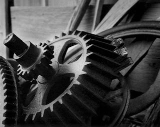
The photograph of the three pulleys on the wall is beautiful; the texture can almost be felt through the viewers’ eyes. If one were to think hard enough the feel of the grains of the wood can be imaged clearly. The difference in size of the pulleys also draws the eyes; with the knot in the wood behind filling in the space below the smaller ones. The grain of the wood directs the view from the left, through the large pulley, then over to and through the smaller pair; it is the finer details that are so effective.
The second image, the one of the train pipes is very similar in tone, but no less interesting. It is the detail on the pipes and the tank and their coverings that produce the focus. The details of the stitching of the jackets and the corrosion of the tank force the viewer to closely inspect the composition. This demonstrates perfectly that a still life image does not have to have a huge tonal range to be eye catching.
Research: Richard Vanek
Born in 1967 in Czechoslovakia. In 1999 moved to the Netherlands. His goal is to make his emotional view of the world visible through his photographs.
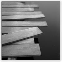
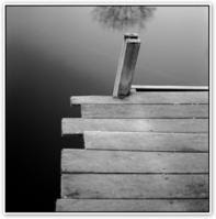
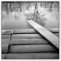
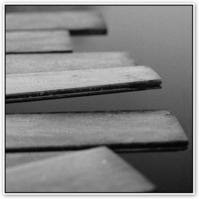
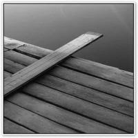

It is the uncomplicated nature of the photographs that drew attention to this photographer. The main reason his work was chosen though was because of images of the planks. This is as simple as still life photography could be, yet without background knowledge from the photographer himself, the work could mean anything.
The focus is on the planks as the background is purposely out of focus. They are all tonally similar and of course of similar shape, however the images do not appear to be the same. Because of the different elevations used and the fact the photos have been taken from different positions, they all suggest a different meaning for each one, this is very intriguing.
The dull tones of the images do seem to suggest a chill: the tones of the compositions, combined with the reflections of the trees in two of them suggest that it the weather is cold. It is doubtful that there would be many people wishing to take a dip in that water.
Each composition also shouts out stillness and peace; a perfect place to be alone, to think or to just enjoy the stillness of nature. It must be of a jetty jutting out into a lake, as there is no movement of water whatsoever.
The uneven, poorly placed nature of the planks of the construction adds greater interest. The lines in the five compositions; in one plane are all parallel (i.e. across the jetty) yet the edges are of different lengths, with some overlaying others, and some probably not properly secured. Would anyone risk stepping out onto it? It takes people to the place and dares them to step forward.
Subscribe to:
Posts (Atom)