The shock of the amount or research to be done was that balanced by the annoyance of then how little had to be done after the initial amount had been researched. The annoyance past when it was realised that it been worth it.
The research undertaken meant that there were plenty of ideas of where to start, and once the chosen word had been contemplated, there was no stopping. Ideas flowed freely and the initial shoot resulted in their being plenty of good compositions.
The main problem was with Photoshop, the time wasted while waiting to edit the images was frustrating. But once the programme was available the experimentation could begin. The visual communication seen in the research allowed the final compositions to be played with. Using burning in to change the focus of the images and experimenting with black and white to enhance the tones and textures allowed the final images to shine.
During this assignment it was clear that personal time management skills were more than up to the task as well as the skills gained for effective researching. When problems did arise, time to reflect and question soon overcame the blockage.
The time given to complete the assignment, given its cut-down final state was more than enough. It was not a challenge, but it was enlightening, both when it came to planning and producing still life work and when it comes to how useful a bit of personal pressure can be in driving forward (especially when there is a huge amount of initial research required).
Showing posts with label Signs of life. Show all posts
Showing posts with label Signs of life. Show all posts
Monday, October 5, 2009

The final images and comments
Final image 1

It is a strong image; the burning around the edges does accentuate the diary on the table top and also removes a lot of the ‘floating’ distraction that was apparent before editing. The main draw of the composition is the difference in texture of the wooden floor, the table top, the diary and the pencil. The main focus however is the heart on the book; it contains the only lines in the image that are not straight. Another contrast is the roughness of the pencil and diary cover when compared to the smooth floor and table. It does look a lot better in black an white than in colour, the tones and textures and exaggerated and that is what proves to be its strength.
Final image 2

Personally this is the better of the two, but there both are very good. The angle at which the photograph was taken was carefully chosen and works to help show the shadows cast by the items: The textures of the diary have become more visible to the viewer than on the other composition. With some of the items themselves it shadow it serve to change the focus. Again it is the heart on the diary as it contains the only lines in the image that are not straight and because the depth of field is quite shallow; it is centred on the heart. The two pencils serve to frame the diary again bringing the views attention back on to it when it strays.
Editing the two final images
The levels and the hue and contrast were altered then they were cropped slightly to centre the main focus of each composition. Both had imperfections that had to removed; this was done using the clone tool. After that all that had to be done was to turn them both to black and white using channel mixer and a bit off burning in was performed to exaggerate area or distract attention from them.
Thursday, October 1, 2009
Reflection
The uploading of all the work onto the blog site has been very straight forward; if everything had been in place initially the task of adding so much would not have been quite so laborious.
There have been a few problems with the site: When it comes to placing text with images, the text does not always line up as desired with the corresponding compositions. And as of yet there is still limited personal knowledge of what can be done using the site, so the layout is basic.
There are a few disappointing aspects to using a blog instead of iWeb. No galleries can be created, this means that all images have to be loaded individually. But before then can be loaded they have to be carefully selected so as not to flood the blog with pictures and they also need to be resized so that they do not take an eternity to load.
Work on this assignment has progressed quickly with no problems. The ideas were easy to develop, the researched proved simple yet time consuming, the shoot was easy to arrange and the images produced were all good examples of still life.
The problem now is waiting; as soon as Photoshop is up and running, the images can be edited and experimented with and a final image(s) can be decided upon. Plus if any do need to be reshot, this can quickly be arranged.
Where next?
Upon closer inspection of the images, it is clear that the final image will come from either;
Photo frames on table tops of different levels, taken from obscure angles (as in image 03).
Or
The diary on the table top; either close-ups of it with a shallow depth of field (image 02) or a simple arrangement on the ‘floating’ table top (image 04).
Results: Diary


This is definitely the preferred idea, with already one possible final image jumping out. Image 01 is suggestive of a writing desk with the book and writing implements to hand. It has height, form, tone and texture. However it is image 02 that stands out the most: it has a shallow depth of field with the focus of the design and tones of the diary; the shadows created by the items grab the viewer’s attention and gives it an atmosphere of melancholy. The final two images (03 and 04) are very similar. The main pull of these compositions is the fact that the table top appears to be hovering above the floor, the fact that the grains of the different woods, emphasise this illusion. It is the simplicity of image 04 that appeals; it is very clean, with good textures, again it is very strong.
Results: Photo frames


The clean lines of the frames, works well with the table edges as does the contrast between the different types of wood on show (as in image 01). The ideas behind them all are very simple, which is why they work well. This contrast is exaggerated in image 02 because of the angle it is shot at; this also gives the feel of depth. A better impression of levels is evident in image 03; this is very strong, as it contains form, depth, height and contrast.
Results: Trinkets


The images themselves are good, but not personally overly appealing. The photographs do show the colours, shapes, tones and textures, but they lack the grab of some of the images to come. The use of angles and depth of field works very well, and the added suggestion of a story behind the compositions also adds to their appeal. There is nothing really wrong with them, but they lack emotion.
Experiments
The experiments are based around three ideas:
Fairy ornaments on a window ledge.
Photographs in photo frames arranged on a table top.
A diary and writing implement also on a table top.
The shoot was done a living room, with huge windows for a lot of natural light. The room was cleared as best it could be to minimise other objects in the compositions.
The idea for using table tops came from the concept of getting contrasts between the photo frames / diary (both wood / wood effect) and the table tops, but also a third contrast with the laminate flooring.
Besides using different angles to shoot from; different levels have also been introduced: a higher and lower table; plus the height down to the floor itself.
Intentions on how to proceed
The best thing to do may well be to collect every item available that can be related to ‘memory’ or to a ‘personal’ memory held and see what can be grouped together or what stands on it own to best portray the word; at least from a personal viewpoint.
The next step would then be to find a place to set up the items for the still life composition. This could range from a window-ledge, a table a door step to the garden itself.
Points that will be considered
- The objects: Their form, shape, texture and colour, when grouping them.
- Location: The amount of natural light available or the amount of light that is desired for the composition.
- When taking the photographs: The position (above, from an angle, etc.) and distance of the camera. The desired depth of field.
- When editing: Black and white vs colour. Tones and textures vs colours and shapes.
Research: Todd Schoenbaum
Very little biographical information available.


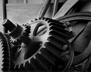
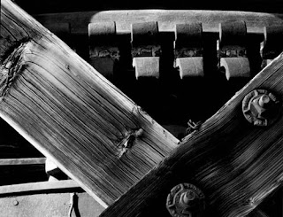
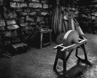

Each of these mages has been taken as the arrangements were found using only the natural light available. The knowledge of this combined with the simplicity of the images leaves the viewer in awe. The compositions are beautiful, almost as if perfect. The images are all recognizable objects that can be sought out by anyone who knows where to go.
The choice of black and white photography again draws the viewer into focusing on the shapes and lines of the items; the tonal range causes the eye to examine each detail of the compositions. The images show the value of experience when it comes to taking a good still life. The success of each image has depended on the correct choice of distance and angle; it is this careful selection that has produced a number of outstanding works.
The photograph of the three pulleys on the wall is beautiful; the texture can almost be felt through the viewers’ eyes. If one were to think hard enough the feel of the grains of the wood can be imaged clearly. The difference in size of the pulleys also draws the eyes; with the knot in the wood behind filling in the space below the smaller ones. The grain of the wood directs the view from the left, through the large pulley, then over to and through the smaller pair; it is the finer details that are so effective.
The second image, the one of the train pipes is very similar in tone, but no less interesting. It is the detail on the pipes and the tank and their coverings that produce the focus. The details of the stitching of the jackets and the corrosion of the tank force the viewer to closely inspect the composition. This demonstrates perfectly that a still life image does not have to have a huge tonal range to be eye catching.
Research: Richard Vanek
Born in 1967 in Czechoslovakia. In 1999 moved to the Netherlands. His goal is to make his emotional view of the world visible through his photographs.
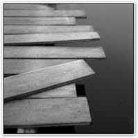
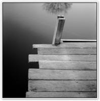
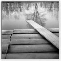
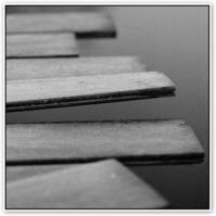
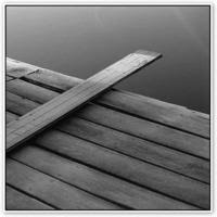

It is the uncomplicated nature of the photographs that drew attention to this photographer. The main reason his work was chosen though was because of images of the planks. This is as simple as still life photography could be, yet without background knowledge from the photographer himself, the work could mean anything.
The focus is on the planks as the background is purposely out of focus. They are all tonally similar and of course of similar shape, however the images do not appear to be the same. Because of the different elevations used and the fact the photos have been taken from different positions, they all suggest a different meaning for each one, this is very intriguing.
The dull tones of the images do seem to suggest a chill: the tones of the compositions, combined with the reflections of the trees in two of them suggest that it the weather is cold. It is doubtful that there would be many people wishing to take a dip in that water.
Each composition also shouts out stillness and peace; a perfect place to be alone, to think or to just enjoy the stillness of nature. It must be of a jetty jutting out into a lake, as there is no movement of water whatsoever.
The uneven, poorly placed nature of the planks of the construction adds greater interest. The lines in the five compositions; in one plane are all parallel (i.e. across the jetty) yet the edges are of different lengths, with some overlaying others, and some probably not properly secured. Would anyone risk stepping out onto it? It takes people to the place and dares them to step forward.
Research: Andre Kertesz
Born 1894, Died 1985. Hungarian-born photographer. He served briefly in World War I before moving to Paris in 1925. World War II pushed him to immigrate again to the United States, where he had to rebuild his reputation through commissioned work. In the 1940s and 1950s he stopped working for magazines. Despite the many awards he collected, he still felt unrecognized; something he felt did not change even at the time of his death.


From review of the images, it is clear that at least at first the main focus was on simple compositions concerning form and tones. Shooting initially in black and white it creates mood throughout the compositions. The eyes follow the shape of the objects used and cause the viewer to ask the questions as to why each object has been chosen and what meaning lies behind each choice. The images are especially powerful, they all contain the full range of tones and make you want to reach in and handle the objects.
The composition of the plate and fork is very powerful; it is so simple yet so striking. Lit from above, so that the shadows fall directly below the objects, the shadows are almost suggestions of reflections of the items. There is the full tonal range on view, from the white of the bowl, the grey of the table to the deep black of the shadows and possibly more important is the contrast of the shiny metal fork to that of the smooth finish of the bowl.
The image of the pipe and spectacles is another personal favourite. All the items are of similar tones, and the table top is a pure white, it is possible to imagine viewing them in person in a museum setting. The only straight lines on show are that of the corner of the table top and also the shaft of the pipe every other line is curved, be it that of the bowl or of the pairs of spectacles. The lines do not share a common direction so the eyes bounce all over the composition as it is being inspected.
It is the simplicity of these two compositions that really makes them, the ideas could hardly be any simpler, yet they really draw the viewers’ attention. The contrasts of the images are incredible, pure white to deep black.
Exploring ‘memory’
Looking at its many definitions ‘memory’ can be explained in many ways. It can be a capacity, a person’s reputation, an impression, a fact or event, even a feeling in mental or physical form.
A photograph in itself is in essence a memory, either of an event, person or just of that instance it in time that it was taken.
It is such a simple, everyday, taken for granted word that brings so many ideas, pictures and feelings to mind. It may be quite hard to portray it effectively.
Ideas on ‘memory’; when related to still life ideas
Diary, photographs and photo albums, trinkets, favourite items, keepsakes, letters and love notes.
Chosen Word: Memory
(Chosen completely at random for the challenge)
Memory:
The mental capacity or faculty of retaining and reviving facts, events, impressions, etc., or of recalling or recognizing previous experiences.
The reputation of a person or thing, esp. after death.
A mental impression retained; a recollection
A person, thing, event, fact
(From dictionary.com)
Definitions
Still life:
A work of art depicting mostly inanimate subject matter, typically commonplace objects which may be either natural (food, flowers, plants, rocks, or shells) or man-made (drinking glasses, books, vases, jewelry, coins, pipes, and so on) in an artificial setting. With origins in ancient times and most popular in Western art since the 17th century, still life paintings give the artist more leeway in the arrangement of design elements within a composition than do paintings of other types of subjects such as landscape or portraiture. (From Wikipedia.com)
Fine Art photography:
There are no universally-accepted definitions (From Wikipedia.com)
- A picture that is produced for sale or display rather than one that is produced in response to a commercial commission
- The production of images to fulfill the creative vision of a photographer
- Also called "decor photography," this involves selling large photos that can be used as wall art.
Assignment Brief: Signs of Life
This assignment requires you to investigate the world of Fine Art / Photographic still life. You must respond to one of these words;
Dead, Fragile, Broken, Delicate, Old, Memory, Time, Place, Structure
You will choose one of these words to help inspire you and direst you image making. You will be required to produce one A3 sized photograph from a digital image on screen and printed for your portfolio.
Subscribe to:
Posts (Atom)